Lihal, the Phases of the Moon

The Making
of Lihal

What makes Lihal, the Phases of the Moon, unique in its approach to storytelling and visual design?

By Kirstin Nicole Bueno & Kyla Calista Sy

Written by Kirstin Nicole Bueno

Designed by Kyla Calista Sy

Lihal is a multimedia project that consists an e-magazine that features Moro people and their lifestyle, an interview video, an infographic video on the thesis paper, and a website that aims to share more about Moro lifestyle and improving their image—providing them links to our videos and direct access to our e-magazine including a printable PDF.

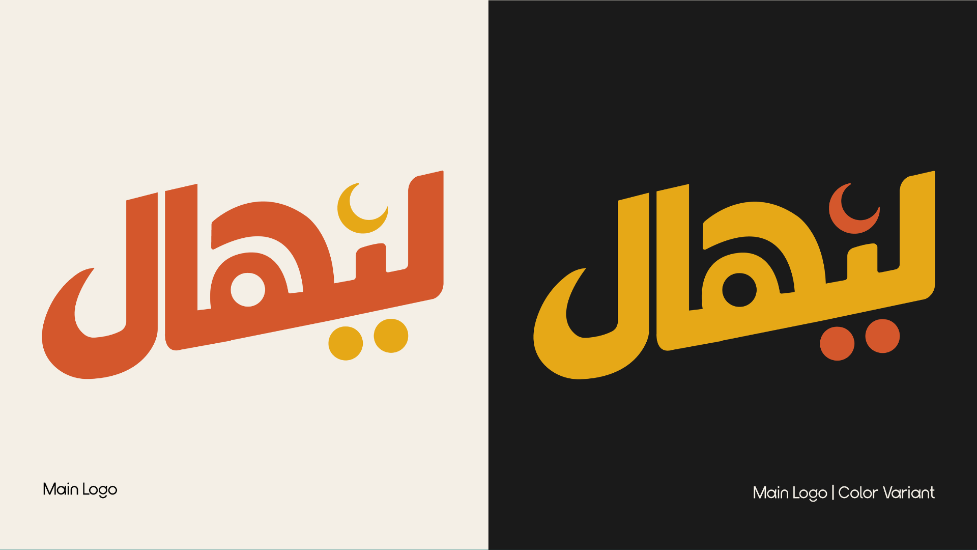
The title Lihal derives itself from the Tausug dialect which means "crescent moon” or “moon crescent,” but it is also a word for lectern or a bookrest that usually holds the Quran or other sacred texts. Moros consists of 13 ethnolinguistic groups in the Philippines who follow Islam and carries culture that is close to precolonial Philippines. Due to past tensions between Moros and non-Moros, Moros are often misunderstood by those who know them only through past historical tensions. This project aims to improve the views of non-Moros on Moros by positioning them in the perspective of their lifestyle, livelihood, and how they still honor their heritage.

"From the eyes of a Moro, they have what they need to keep on going—knowing who they truly are and where they come from."

— From the Eyes of Moro, Page 4, Lihal

The logo of our project is the Arabic transliteration of Lihal transformed into a simplistic style inspired by Arabic graphic posters that step away from the sharp edges of traditional Arabic texts and the shape of a mosque. Lihal means “crescent moon” or it can refer to the lectern that holds important Islamic texts.

Traditional Arabic calligraphy is often curvy with sharp ends or edges, which may seem too intimidating for people not familiar with the writing, thus the “sans serif” like design was created to look more readable and visually appealing while still being readable enough for those familiar with it.

Apart from the simplistic iteration, the logo is shaped similarly into a mosque as ليهال looked similar to the pillars of a one.

The tanwin (grammatical feature) for the letter “i” has been designed into a crescent moon with the ones on the bottom into circles mirroring the structures of the crescent moon on top of mosques.

Lihal logo variant
View Full Lihal Brandbook